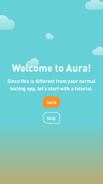
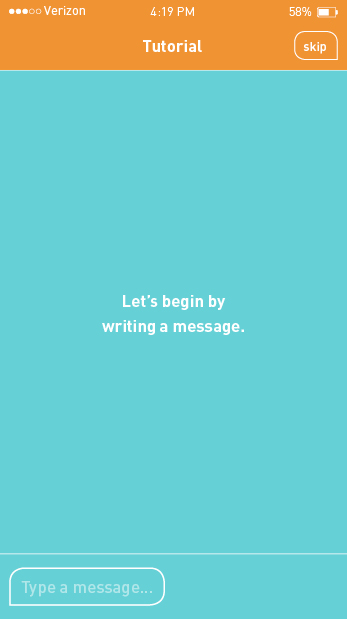
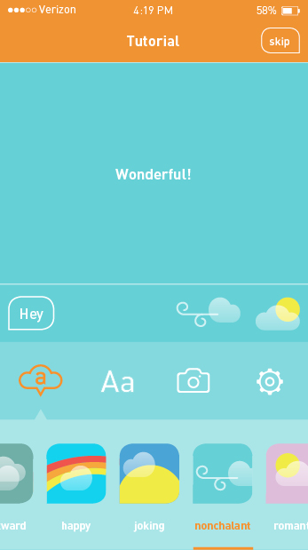
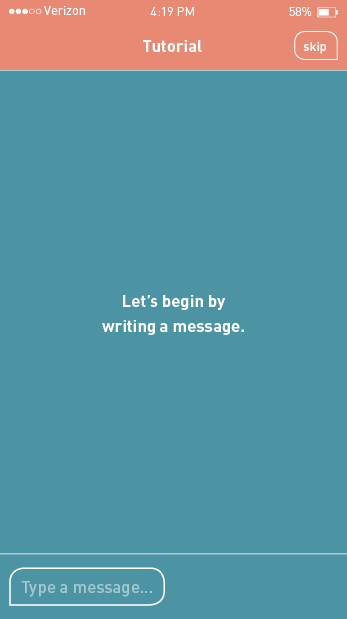
I created a wirefames to see how I app map would flow and understand how InVision works. From piecing my screen together, I quickly learned that my idea was too complex and cumbersome (see it here). I revisited my app map and made a priority of the features to tackle. Some had to go such as draft and timed messages. I was concerned this feature may lead to too many automated messages, working against the goal of making text messages more humanistic. I then designed the first few screens to experiment with color. After I refined the color, I designed more screen to round out the experience. Although there are holes in the lo-fi design, this should give me an overall structure to develop and refine. To see the app map reprioritization and lo-fi design…


