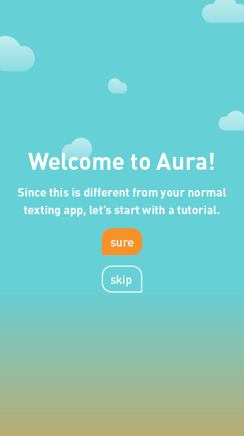
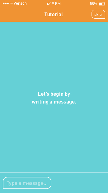
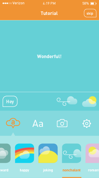
I created a wirefames to see how I app map would flow and understand how InVision works. From piecing my screen together, I quickly learned that my idea was too complex and cumbersome (see it here). I revisited my app map and made a priority of the features to tackle. Some had to go such as draft and timed messages. I was concerned this feature may lead to too many automated messages, working against the goal of making text messages more humanistic. I then designed the first few screens to experiment with color. After I refined the color, I designed more screen to round out the experience. Although there are holes in the lo-fi design, this should give me an overall structure to develop and refine. To see the app map reprioritization and lo-fi design…
The process for branding Aura is underway! I sketched ideas for the logo and roughly designed them on the computer. Form variations were designed before adding color variations. In order to decide on a direction, I created four solid color variations of the logo and app icons that were then user tested with 50 audience members. The decided logo will allow me to further develop and brand the auras, develop the app, and test the flexibility of the logo and develop a full brand.
I took a semester long "break" from my thesis in order to learn about a comprehensive branding process and UI/UX game design. In the interim I also started a preliminary wireframe, sketched logo designs, designed logo roughs, and caught my research book up to speed (the process for these are coming soon). Now it's time to focus on completing Aura and roll out its branding, advertising, and marketing. I will need to do extensive user testing in order to successfully execute Aura. Here some some possible research methods:
Rapid Iterative Testing & Evaluation
With lots to do this semester, this research method will allow me to quickly spot and fix problems in wireframes and higher fidelity prototypes. Changes are made as soon as problems are identified during user testing and the updated prototypes serves as the new design direction.
Evaluative Research
As a balance to the very performance- and product-based testing of Rapid Iterative Testing & Evaluation, this research method focuses on preference measures. Subjective feedback including aesthetic and emotional responses is collected. This more humanistic emphasis is incredibly important for my project where I aim to make digital communication more humanistic. I especially intend to use this method when refining the auras.
Crowdsourcing
As I approach the high-fidelity stage of prototype, I intend to target a large group of people to get feedback. Using InVision allows me to share a link to a prototype and receive comments. I will send the link through an email blast and on social media.
To sum up everything that I accomplished in the past 15 weeks, I started the design of Kiss & Tell. Its missing the introduction page and first two chapters. The introduction will be about Kiss Me Through the Phone envisioned as a research organization and the aims of the book. The first chapter will discuss the problem and common cases of misunderstanding. The second chapter will discuss why the problem exists and who it affects. To see the book in progress…
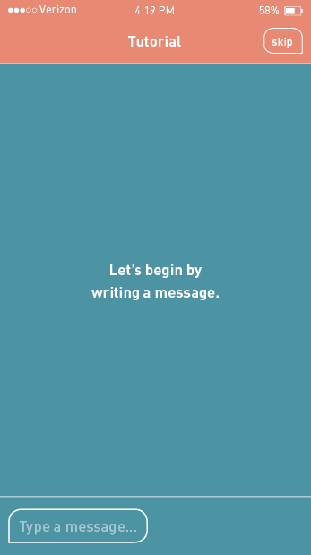
Using the sketches, a scenario was created with tasks for a first-time user. Additional screens were sketched in order to complete all tasks. The sketches were printed and given to four iPhone users who were closely aligned with the personas. As users progressed through the scenario with the prototype, their confusion provided insights on how to improve the app. Here's what I learned:
- The tutorial should function like a game where it tells you how to do something and the user has to complete the action in order to proceed to the next page.
- Add skip option to tutorial.
- The tutorial section should be designed to look more like the app itself.
- There is no tutorial screen about the drawer and it competes with the iPhone’s drawer of quick access tools. Drawer bar is hard to see. Get rid of pull up drawer and have options always show at the bottom.
- Tutorial should follow the flow of the menu bar.
- Instead of pressing and holding, add a clear option to the list of auras in the aura menu.
- I need to add two more screens to the tutorial about how drop and drag works throughout the app. I'll make one about applying auras and another about adding a photo.
- I need to add two tutorial pages to the draft section: one about dragging and dropping drafts to the typing area to edit them and another about how the timer feature will work.
- Put the tutorial in the drawer within an options menu so users can access the tutorial whenever desire. Options will allow users to be able to do things like change the default aura and set favorite auras.
- Make room for options menu by combining the two photo menus into one. There’s one icon for camera and another for recent photos. It’s better to just do one photo icon that leads to recent photos and there’ll be two sub icons: one for library and another that goes to the camera app.
- To prevent confusion and obstruction of the aura in the message preview area, move aura button to the drawer.
- Make room for aura menu by getting rid of mic icon since this is already on the keyboard.
- Sounds can be used as confirmation of an action like a sound playing when a draft is saved or the text conversation is muted. These sounds are rewarding.
The insights lead me to refine the app map. To see the full process…
I went through Designing for Interaction to come up with a solid process to develop the user interface and user experience of Aura. First I reminded myself of the goal of Aura, the challenges that I faced, and the features it needed to include. I then did an assessment of Messages, the current texting app on the iPhone, by taking screenshots of different functions and designing its app map. This helped me to determine what was working and what was not. Turning to Aura, I listed lots of ideas for its tagline. I created three personas and scenarios for each about how they would possibly use Aura. The scenarios were inspired from the user journey maps that I created from the discussion party. I then listed all the tasks that users needed to be able to do on Aura and designed a task flow for a sensible order that these tasks would occur in. Looking at the app map for Messages and the task flow, I designed a map app for Aura (above). This helped me to design wire frames for the essential and unique screens and functions of Aura. I took the wire frames and sketched visuals for the placeholders. To see this process…
I refined the look and animation of the auras based on the feedback I received from the interviews. I created the final testing site to crowd source, reaching the wider audience and getting a higher quantity of feedback. I made the testing site password protected to ensure that I only get feedback from my target audience: females in relationships who text their partner often. If you are a part of the audience, please contact me to receive the password!
The previous surveys have been open to a wider audience because I have a market audience (anyone interested in using this app) and a target audience. Since I learned that females are more likely to be misinterpret text messages (or at least report it) from my previous research, I am solving a problem from an audience most in need. If I can solve a problem from those most in need, it'll apply to other audiences. The target audience will help to refine how the auras are interpreted and market audience will help to test and refine the concept and functionality of the app. While I am getting feedback on this, I'll be working on the UI and UX of Aura.
I did three interviews to test the expressiveness of the rough auras: one in person and two over the phone. I asked my participants to watch the 12 animated auras (above) and tell me how they interpreted them. Afterwards I explained my intended emotion and asked how I could change or improve them. In a nutshell, here is what I learned:
Things that work:
- Participants can sense the difference between negative and positive auras.
- The design is inviting and easily understood.
- Nonchalant was picked up on by all participants.
- Angry was understood by all.
- Sad was also understood by all.
Things that need improving:
- No one understood sarcastic and all thought it was not needed since it's the same as joking.
- No one understood awkward.
- Confused is not needed since people would likely express that with words.
- Tired looks too playful.
- Scared reads more as tired.
To see a full summary of my findings…
I received a total of 33 responses to the looks survey with some helpful feedback. Here are some highlights:
- Vote: A
It’s cleaner and more legible. The others don’t look as real, if that makes sense. You want to use a style that people are used to, then they’ll be more inclined to use it. You don’t want to reinvent the wheel with your thesis project. :D - Vote: A
It’s easier to see exactly what the weather means. The watercolor/sketchy look is visually appealing, but also distracting. - Vote: A
While it looks less “artsy,” it is the easiest “read.” I get the emotion quickly with the colors that convey the mood. Where as the others have me looking at the art and/or font. - Vote: A
Look C would be my second choice because of the changes in the text. - Vote: B
Look B has greater readability and cleaner execution of the water color graphics than Look C. The non-filled text box defines the text but still allows the text to be integrated with the weather mood. Look A favors the text the most but the weather moods are too cartoonish and create a more cluttered look.
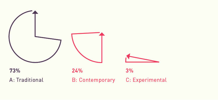
Through all the experiments with staining and hand writing, it seems that my app is experimental enough that the style should be in a style that users would expect it to be in. Even though my app will have a more traditional look, the more experimental looks provided me with some insight. The outline text boxes works well visually and functionally and the animation of the text plays a large role in how the aura is interpreted.
Looking back at my process, I have arrived at a very experimental project and visual language: getting rid of the text bubble, using handmade elements and typography, and staining. According Raymond Loewy MAYA principle (most advanced yet acceptable) “the adult public’s taste is not necessarily ready to accept the logical solutions to their requirements if the solution implies too vast a departure from what they have been conditioned into accepting as the norm.” So I have to ask myself: Have i gone too far?
My original concept for weather looked very UI, flat, and exactly what you'd expect to see (Look A: Traditional). Through experimentation I combined line art weather elements with stains and simplifying the text bubble to a stroked rounded rectangle (Look B: Contemporary). More experimentation and refinement lead me to hand drawn weather elements with stains, eliminating the text bubble entirely, and combining expressive handwriting with digital typography (Look C: Experimental). Rather than making an subjective decision, I'll let my audience decide.


