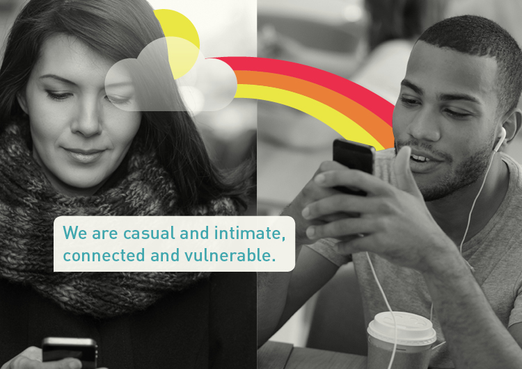
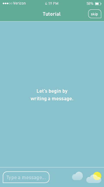
Here's the the thesis summary video, as I prepare for final review, that will be used as a commercial for Aura.
The full swag set and Brand Book are in!
I refined Aura's visual language, website, and brand book. I also designed business cards and swag for the launch party (including a balloon, tote bag, and sunglasses). To see the progression of the brand book with these elements…
With final review ahead next semester, here's what I intend to complete:
- split Kiss & Tell into two research books: First Date and Honeymoon.
- refine current video into a technical "how it works" video
- make a commercial for Aura that will serve as the presentation summary video
- produce tote bag, sunglasses, umbrella, and splash boards for launch party
- shoot own photography for visual language
- add press page to website
- complete brand book
- create PDF presentation
As I continued working on my brand book and refining my visual language, which now has a softer and blended look, I realized I needed to start on the website and app store presence. I designed a splashy, six-page website to merely create excitement and drive people to the app store. The second page has a container to a commercial, which I will work over winter break. I also designed two pages for the app store.
To see the progression of the brand book…
To see the website…
To see the app store…
I solidified my visual language and typesetting for Aura and continued working in the brand book. Much to do! To see the progress on the brand book…
I finally shot a video that is clear and looks good. They key: studio lighting. Now I have to do some video editing so it has some quick zoom ins and focused shots as well as add music and sound. I could also put an animated logo at the end with the tag, turning this into a commercial. I want it to be like this app's video.
I am continuing to refine my research book and seeking ways to make it more emphatic and consolidated. It's 274 pages right now! Sheesh. I also started working my the brand book and came up with 4 visual language options (how type, image, and illustration integrate to communicate the brand). Which do you like best? To see my first round of visual language ideas and the beginning of the brand book…
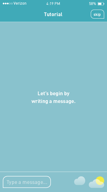
Even though the orange-blue color palette yielded a higher preference during the user-testing of the logo development, a warm/cold blue color palette worked best when building out the app. This final color palette was applied to the lo-fi prototype, which was developed and designed further. I placed the screens and linked them using InVision up to the options section, where I'm awaiting feedback on which tutorial icon to use. I also started animating sections to get a feel for the process and to refresh myself on After Effects. The loading and last splash pages are animated, which you need to tap "Skip" to view.
To view the flat design…
While developing the low-fidelity prototype, I questioned whether the chosen color palette was the most appropriate, a design by trial method. I came up with three alternatives for the logo and app icon and applied them to the first five screens of the app. Regardless, I continued with developing and designing the prototype using the original color palette. I filled in missing parts to the tutorial and refined the app's iconography. To see the app's development…
The process for branding Aura is underway! I sketched ideas for the logo and roughly designed them on the computer. Form variations were designed before adding color variations. In order to decide on a direction, I created four solid color variations of the logo and app icons that were then user tested with 50 audience members. The decided logo will allow me to further develop and brand the auras, develop the app, and test the flexibility of the logo and develop a full brand.


