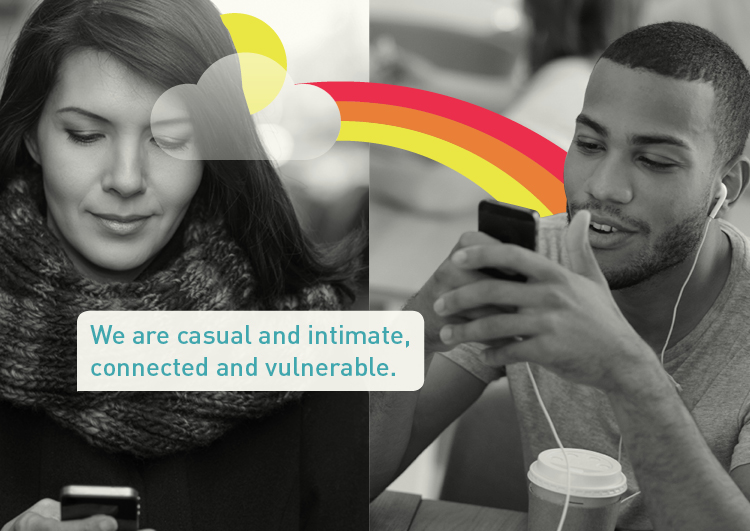
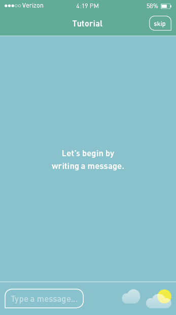
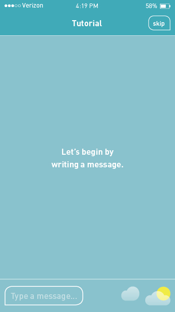
I solidified my visual language and typesetting for Aura and continued working in the brand book. Much to do! To see the progress on the brand book…
I finally shot a video that is clear and looks good. They key: studio lighting. Now I have to do some video editing so it has some quick zoom ins and focused shots as well as add music and sound. I could also put an animated logo at the end with the tag, turning this into a commercial. I want it to be like this app's video.
I am continuing to refine my research book and seeking ways to make it more emphatic and consolidated. It's 274 pages right now! Sheesh. I also started working my the brand book and came up with 4 visual language options (how type, image, and illustration integrate to communicate the brand). Which do you like best? To see my first round of visual language ideas and the beginning of the brand book…
I experimented with a mockup video for my demo conversation but the free version places a watermark on top. I then tried shooting another video with my DSLR but it ended up coming out grainy with a black background. I plan to do more series of tests. In addition I worked on my process book to get it ready to print, as this app is coming to a close. Branding and marketing are next!
Rather than making the conversation seem live, requiring me to build out every step taken to send a text message in this string, I made it a review of texts sent and received and then a response. This allowed me to be time efficient which still showing the majority of the auras and creating a new text. The above video is a rough cut of me demonstrating this prototype. I plan to record with a member of my target audience with better lighting. To experience this for yourself…
Please keep in mind that this prototype has a very specific path of behaviors because the goal was not to user-test, but rather demonstrate a sample conversation.
Now that the tutorial is in a good place, I am moving on to creating another prototype: an example conversation. This prototype will be designed, animated, and made interactive like the tutorial but with very specific actions and not intended to be user-tested. I will have someone learn the actions to create the messages and time the incoming messages. Filming this interaction will make the app seem like it's being used in real-time.
I wrote the full conversation and designed how it would look in Aura. To view the conversation…
I started to design the steps the user needs to go through to create the messages and marked up the PDF so it makes sense. To view the conversation that I began to be broken down…
I simplified the overview even more and distilled it down to a six slide experience that the user could scroll through. At the end of the overview the user can decide whether to go to the longer, interactive tutorial or just get started using the app. I integrated this overview with the tutorial and animated the various parts of the tutorial, elevating the prototype from low-fidelity to high-fidelity.
I user-tested eight users, one of whom was new to prototyping this app. All of the users enjoyed and understood how to use the app and found getting started much faster. They were also pleased with the animated sections. To see the user-testing of the integrated tutorial…
I designed a brief overview of Aura that has seven sections: anatomy of the app, writing and sending a message, replaying a message, accessing the main menu and adding an aura, how the app forecasts auras, styling text, and how to access the interactive tutorial. This overview automatically walks through the steps and allows the user to proceed to the next section on or replay at the end of each section.
I user-tested eight users, four of whom were new to prototyping this app. All users reported finding the tutorial helpful, easy to understand, and quick. One major insight to consider is that are many apps with three to five page, super simple tutorials that you scroll through and understand quickly. Perhaps this something to consider when creating an ad for Facebook. To see the user-testing of the overview…
I finished making the lo-fi prototype in InVision and user-tested four people. After each round, I made revisions to the prototype based on problems that the user encountered and suggestions made to clarify instructions. View the current iteration of the prototype here.
The biggest insight gained was although this tutorial is interesting and helpful, it is long and makes the texting process seem complicated. I do not plan to scrap this but instead I will create a brief overview. Rather than a first-time user being met with this tutorial, a brief overview will be made to show the anatomy of the app, simple texting and sending, adding an aura and sending, how the app predicts (forecasts) auras, text styling, and how to access this longer tutorial. The overview will not be interactive. Instead it will be a series of animations for each step where the user has to confirm that s/he "got it" to move on to the next step. To see the rapid iterative testing…
Even though the orange-blue color palette yielded a higher preference during the user-testing of the logo development, a warm/cold blue color palette worked best when building out the app. This final color palette was applied to the lo-fi prototype, which was developed and designed further. I placed the screens and linked them using InVision up to the options section, where I'm awaiting feedback on which tutorial icon to use. I also started animating sections to get a feel for the process and to refresh myself on After Effects. The loading and last splash pages are animated, which you need to tap "Skip" to view.
To view the flat design…
While developing the low-fidelity prototype, I questioned whether the chosen color palette was the most appropriate, a design by trial method. I came up with three alternatives for the logo and app icon and applied them to the first five screens of the app. Regardless, I continued with developing and designing the prototype using the original color palette. I filled in missing parts to the tutorial and refined the app's iconography. To see the app's development…


